Secondary Source
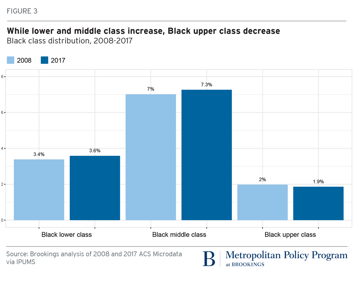
This chart illustrates the class distribution of people who are Black (12.4% of the total population in 2008, 12.8% in 2017).
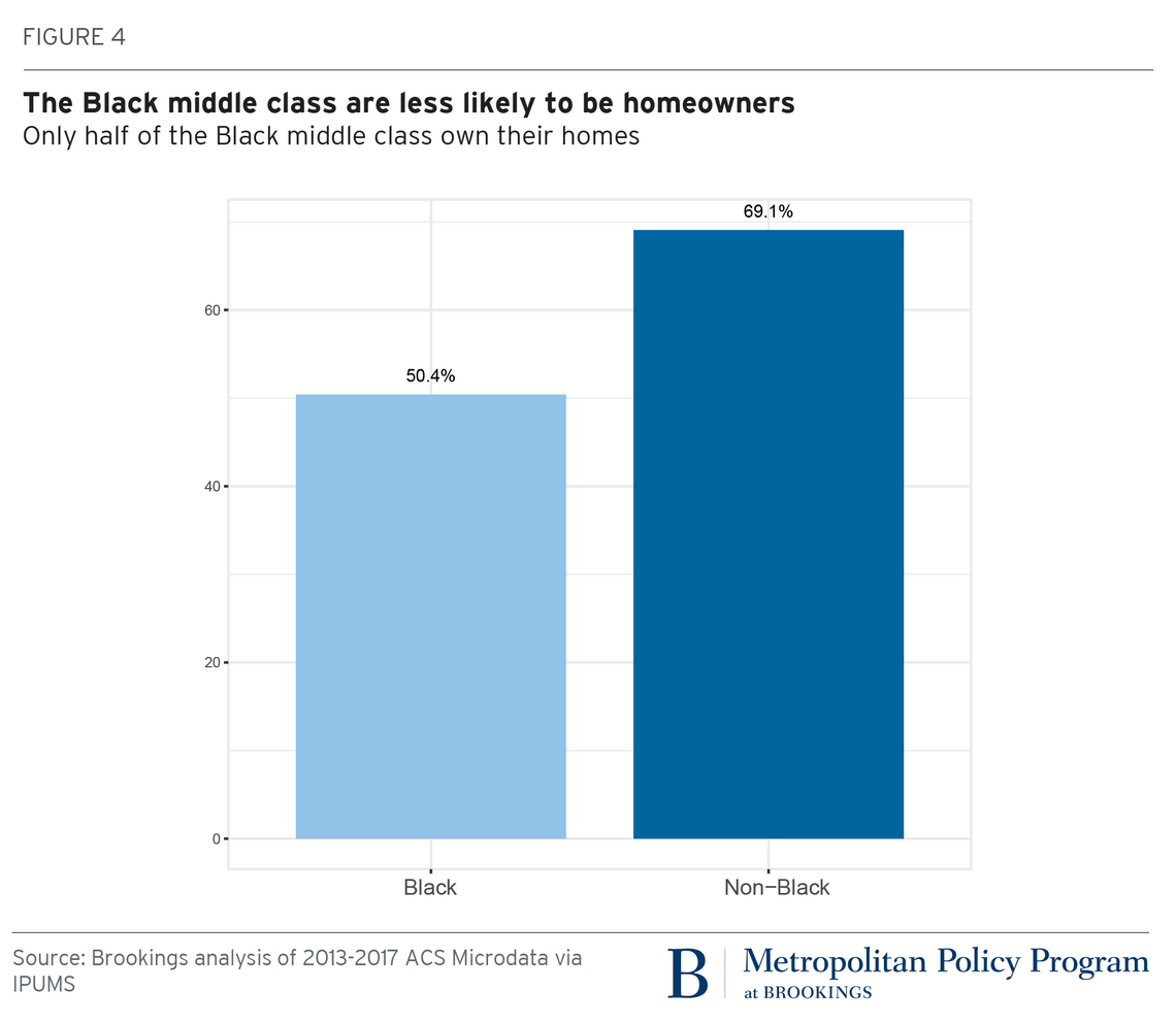
This chart shows the percentage of Black middle-class people who own their home, compared to non-Black middle-class people.
Source: Brookings Institute, Bar graphs analyzing “While lower and middle class increase, Black upper class decrease” and “The Black middle class are less likely to be homeowners,” 2020